WEBSITES
UNDERGROUND PLANT TRADE
about this project
the Underground Plant Trade was a project started by DJ Freedem to provide plants, specifically, to Black people.
it started with a tweet that went viral at the height of 2020's civil unrest. eventually, the original Instagram account that functioned as a facilitator of plant trading evolved to an online platform——a project recognized & sponsored by Dazed & Confused Magazine, in addition to Converse.
in designing this website, i collaborated with Freedem & our Web Developer to build this dreamy, MySpace-nostalgic, forum-format website.
published: September 2020
process
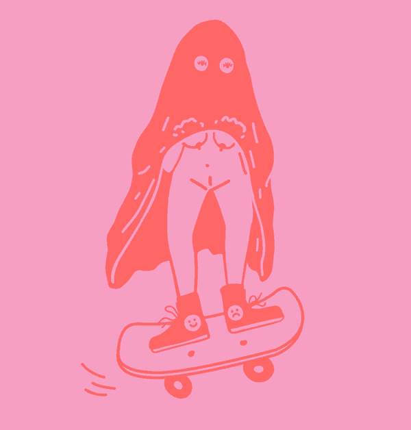
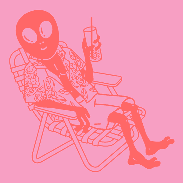
i felt very clear about Freedem’s aesthetic preferences. i, do consider myself an alt-plant-mom-girlie. i developed a sensibility that merged Matrix energy with sparkly fairy garden vibes.
beyond transporting the user into this world, i designed an interface that would be easy for the user to navigate for plant trading, hear success stories, & learn more about Freedem’s mission.
gifs
sprinkled about in the website were many GIFs dancing on the page.
i grouped my ideas by stories like Healing Feeling, Beefy Leafy, & Glitch Witch.
ultimately, we picked a couple options from every idea based on what would imbue the most magic on each page.


“this whole project totally went BEYOND my vision & for that i am thankful!”
-DJ Freedem
24TH STREET STUDIOS


about this project
24th Street Studio is a POC, women-owned-&-run tattoo shop in the heart of San Francisco’s Mission District.
the tattoo industry, has a bit of a boy’s club reputation, sometimes conveying tough & traditionally masculine imagery.
Renette, the owner, had a vision of the shop that turned that convention on it’s head. first & foremost, it was imperative that the shop communicated that it was a safe-space to all people. the shop itself is overwhelmingly cute with a smidge of some edge——of course, the website had to match.
published: October 2021
process
a full embrace of femininity & sweetness was essential.
naturally, the core color was pink, accompanied with high-impact optimistic colors. i ensured the type choice was delicate but legible. though, i made sure to maintain a level of edge by anchoring every page with large chain art in the background.
as accessibility was of utmost importance, it was key to showcase photos that underscored that the physical space was LGBTQ+ friendly, ADA accessible, & that Spanish translations were available.
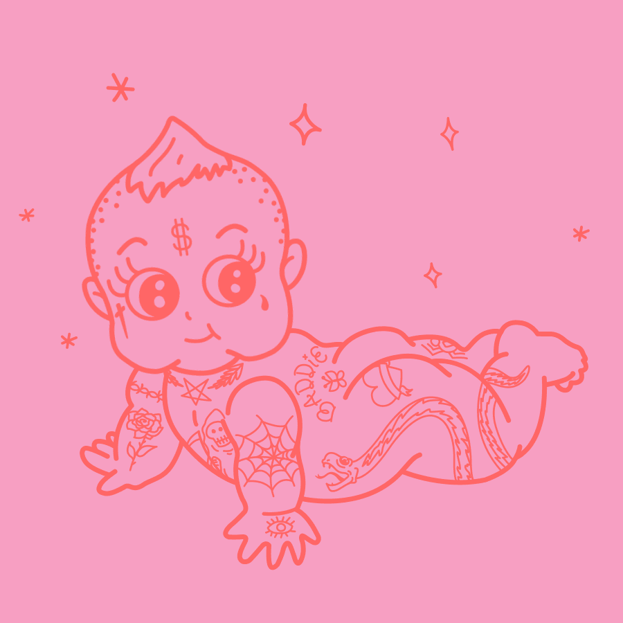
GIFS
i pulled inspiration for these GIFs from traditional flash tattoos you would find on the walls of pretty much any tattoo shop.
undoubtedly, it had to have a cute & fun twist on them.